Overview:
October 14, 2022
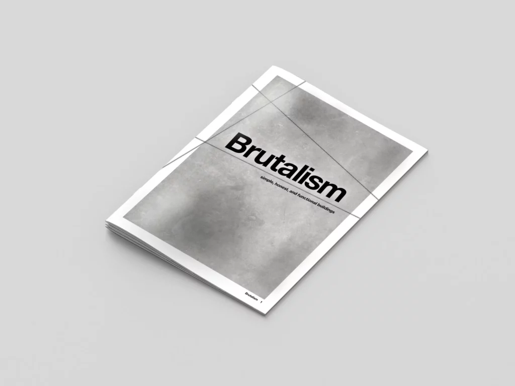
Brutalism is a mini magazine and ePub made in adobe InDesign. The topic is brutalist architecture; the meaning and characteristics of this architectural style.
Brutalist architecture is a style that emerged in the mid-20th century, particularly in the 1950s and 1960s. It’s characterized by its use of raw concrete, bold geometric forms, and a focus on functionality. The term “brutalist” comes from the French word “béton brut,” meaning raw concrete.
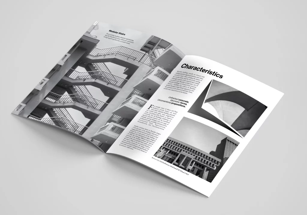
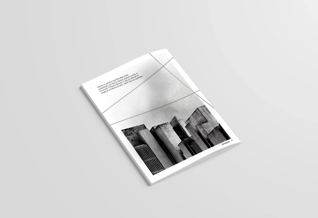
In the project, I utilized margins, bleed, and layout grids to achieve a clean print look. Margins ensured professional spacing, bleed enabled seamless printing, and layout grids maintained consistency and balance.


Typography:
Neue Haas Grotesque sans-serif
I went with Neue Haas Grotesque for the title and heading text for the spread. I used different weights and styles of the font to improve the flow of the text for the reader, and visually communicate key points throughout.
Eb Garamond serif
I went with Eb Garamond for the body copy of the magazine. I wanted a simple serif font for readability that paired well with Neue Haas Grotesque.
Programs used: Adobe Illustrator, Adobe Photoshop
Role in the Project: Graphic Designer
