Overview:
October 21, 2022
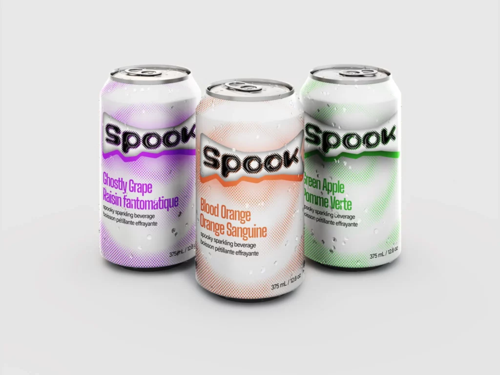
Spook is a concept Halloween-themed soda beverage intended for seasonal marketing. The intended market for this product is young adults who experienced Halloween during the early 2000s. The half tone graphics and bold typography pulled inspiration from Y2K aesthetics to bring a sense of nostalgia to the product.
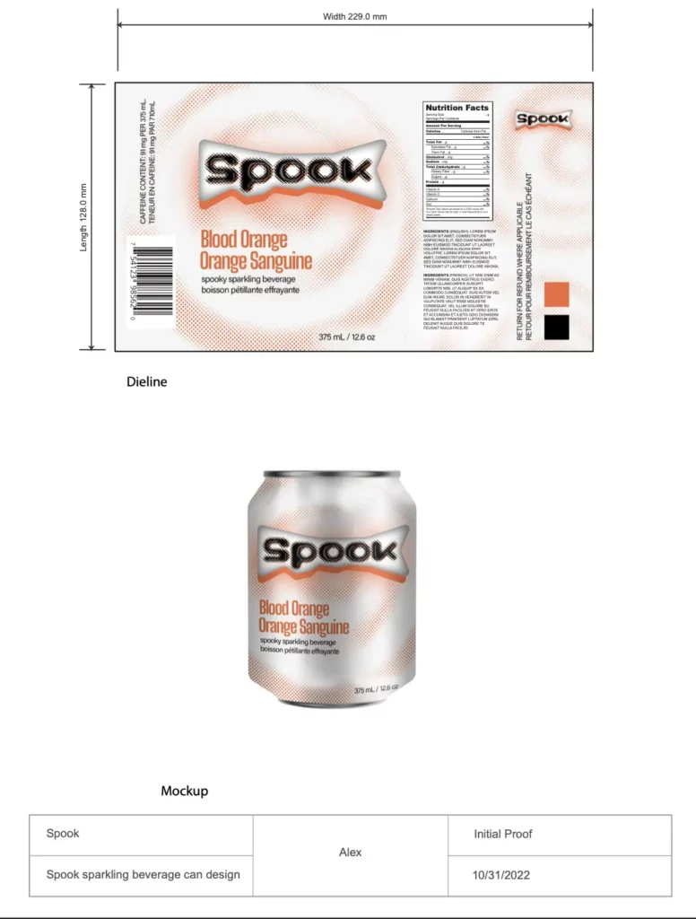
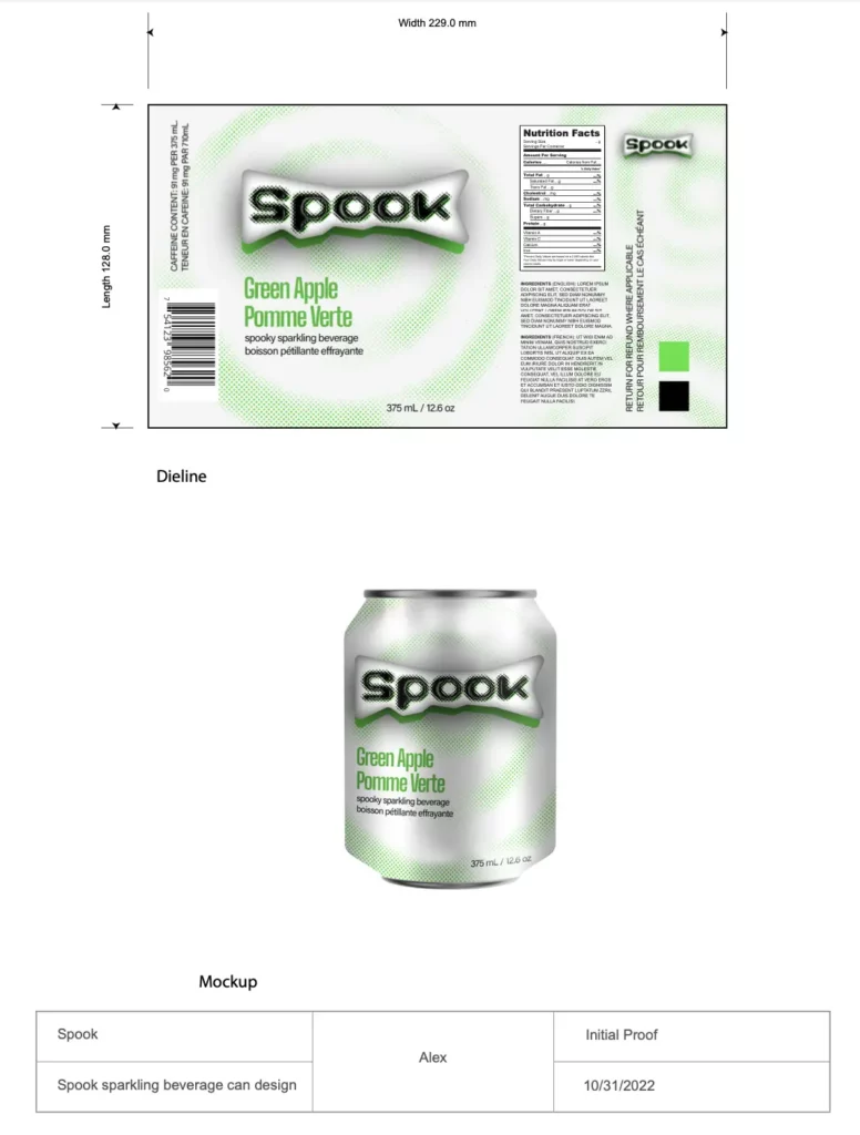
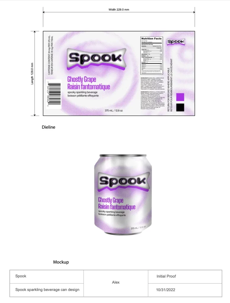
The label is mocked up using die lines for a 375ml can. The packaging has both French and English languages because it’s intended to be sold in Canada.
The original label was made into a smart object to mock up on the soda cans. lighting was added to make it appear like a real can.

Proofs:


Typography:
Synkopy
I tested a lot of fonts for the logo text, and I ended up choosing Synkopy because it matched the Y2K aesthetic I was going for the most.
Big Shoulders Display
I choose to use a condensed font for the label to allow the flavor of the beverage to stand out in the visual hierarchy.
Programs used:
Adobe Photoshop, Adobe Illustrator
